#WHYVOTE
Social Media CampaignFocus
Social / Brand / Motion
Means
Figjam, Illustrator, Photoshop, After Effects
Collaborators
︎︎︎ Nina Bommarito
︎︎︎ Rachel Wixson
Timeline
3 weeks
Summary
#WHYVOTE is a social media campaign focused on engaging busy adults aged 18-22 in democracy, all while emphasizing the simplicity and ease of voting.

context
Young adults have the lowest voting turn out of any age group in the United States. Often, this lack of participation is believed by older groups to be the result of political apathy. However, voters in their early adulthood face significant barriers to participating politically. Student commitments, inflexible job schedules, and lack of sufficient transportation all restrict young voters from reaching the polls.
#WHYVOTE USA is the end goal of a design competition that aims to encourage and empower young adults to participate in United States democracy. Hosted by Creative Conscience and youth empowerment platform VoiceBox, the contest was open to submission by college students and recent college graduates. The competition required the submission of materials that aligned with their existing brand guidelines, as well as aligned with their goals of exciting people to vote. Submissions were allowed in the form of an Instagram carousel, a 15 second motion graphic, and/or a 30 second vlog.
research
In a three week-long design sprint, my teammates, Nina Bommarito, Rachel Wixson, and I rapidly accelerated our typical design process to create all three submission types. Through our group research, we learned about what significant barriers young voters face, and decided that we wanted to reduce those through our #WHYVOTE campaign. Since individuals in their late teens and early twenties are new to voting, they often lack proper education regarding the needed steps and ways to vote. We constructed a concept that prioritized informing and educating our target audience about how voting can be done quickly and easily.
Collaborative research FigJam

Guidelines drafted for our brand, using colors and fonts as required by the contest
visualization
“Everyone talks about how important it is to vote, but how exactly do you do that? It can be stressful figuring out how to vote, where to vote, and deadlines along with all the other stuff going on throughout college. Our campaign engages voters aged 18-22 and gives them access to resources and information so they can take actionable steps.”
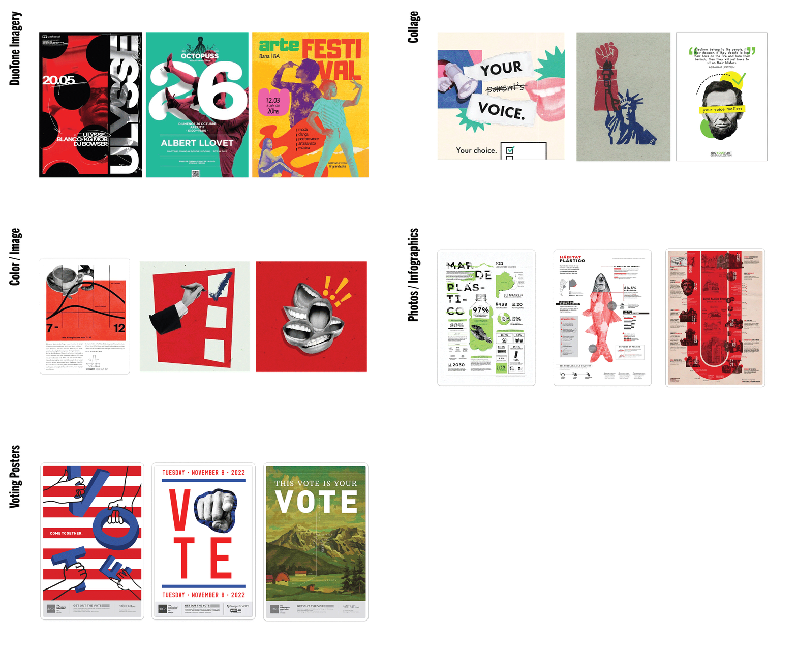
After we established our concept statement, we began our visualization process. Guidelines for our concept were drafted, including the colors, type that #WHYVOTE required. Imagery was inspired partially by their guidelines, but by old voting posters, collages, and infographics as well. After establishing our visual language, I began to sketch thumbnails for the vlog.

Moodboard inspiration
 Thumbnail sketches
refinement

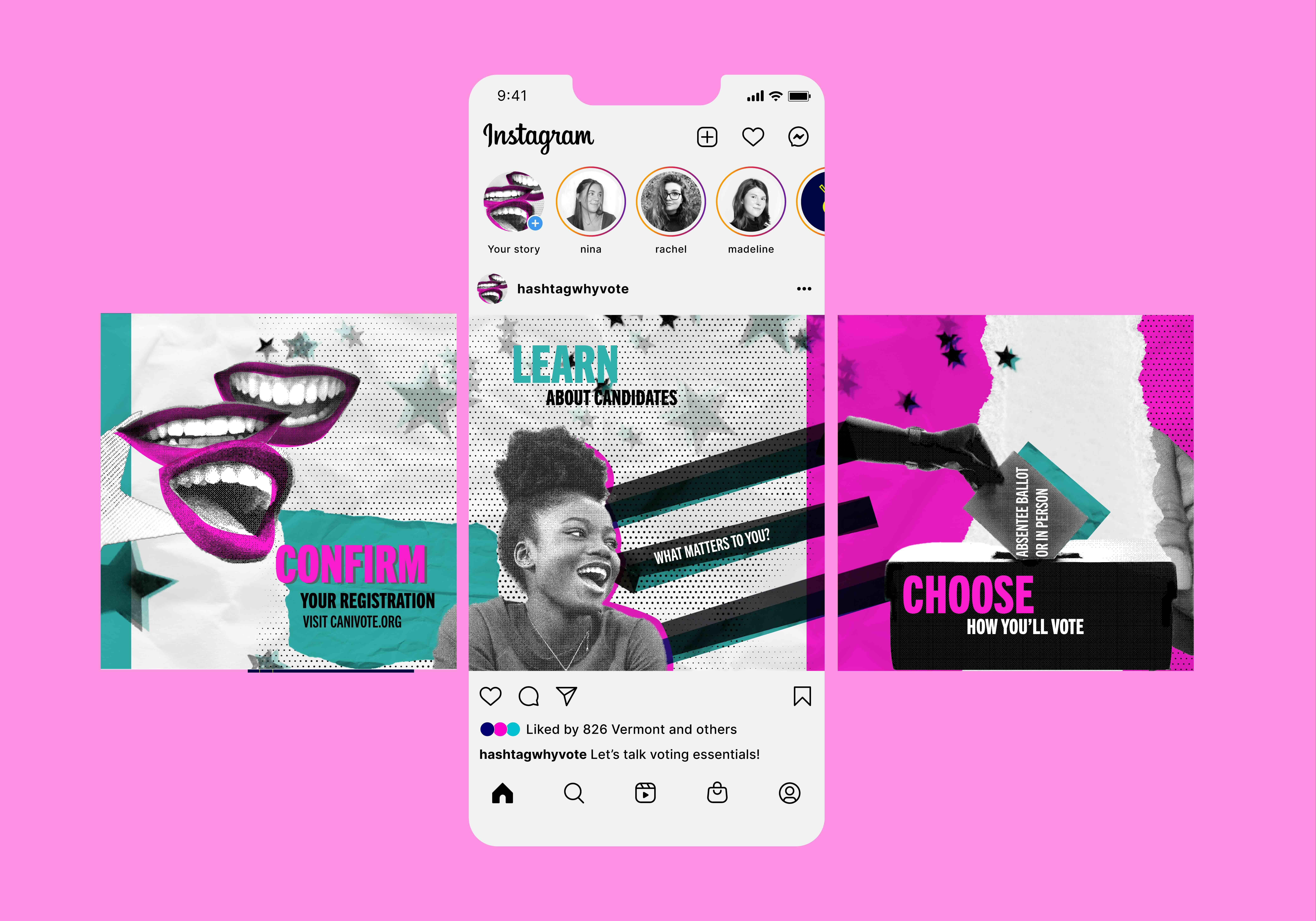
Instagram carousel process by Rachel
After constructing our first drafts, Nina, Rachel, and I stepped back and assessed our progress after a critique. It appeared that there was too much type in the graphics, which contradicted our goal of easily digestible content. Music was too slow and dreary for a quick and snappy process. Easing needed to be “punchy-er” to catch the attention of our audience. Each of us outlined our needed edits and continued to work towards our end goal: a campaign that was engaging, easily accessible, and impactful.
Long-form motion/vlog first draft by Madeline
Short-form motion first draft by Nina
outcomes
Our graphic
language utilizes typefaces, image treatments, and colors as required by the
submission guidelines. However, we added additional stylistic guidelines to flesh
out our message. Our imagery contains quintessential items to participate in
democracy: voting materials and the voters themselves. Paper textures echo a
well-loved planner or calendar, as it is important to plan ahead in voting.
Text is kept minimal to increase the speed at which information is consumed.
Movement in motion pieces is fast and snappy, emphasizing the speed at which
registering and voting can be done. After feedback
from our classmates, we concluded our project by submitting our long-form
motion piece to the competition.
lessons learned
lessons learned
- Get inspired! Making motion without inspiration is DIFFICULT.
- Precompose your scenes and name your files, time is wasted looking for the right piece to move.
- When in doubt, ask your friends if your easing looks right.
